
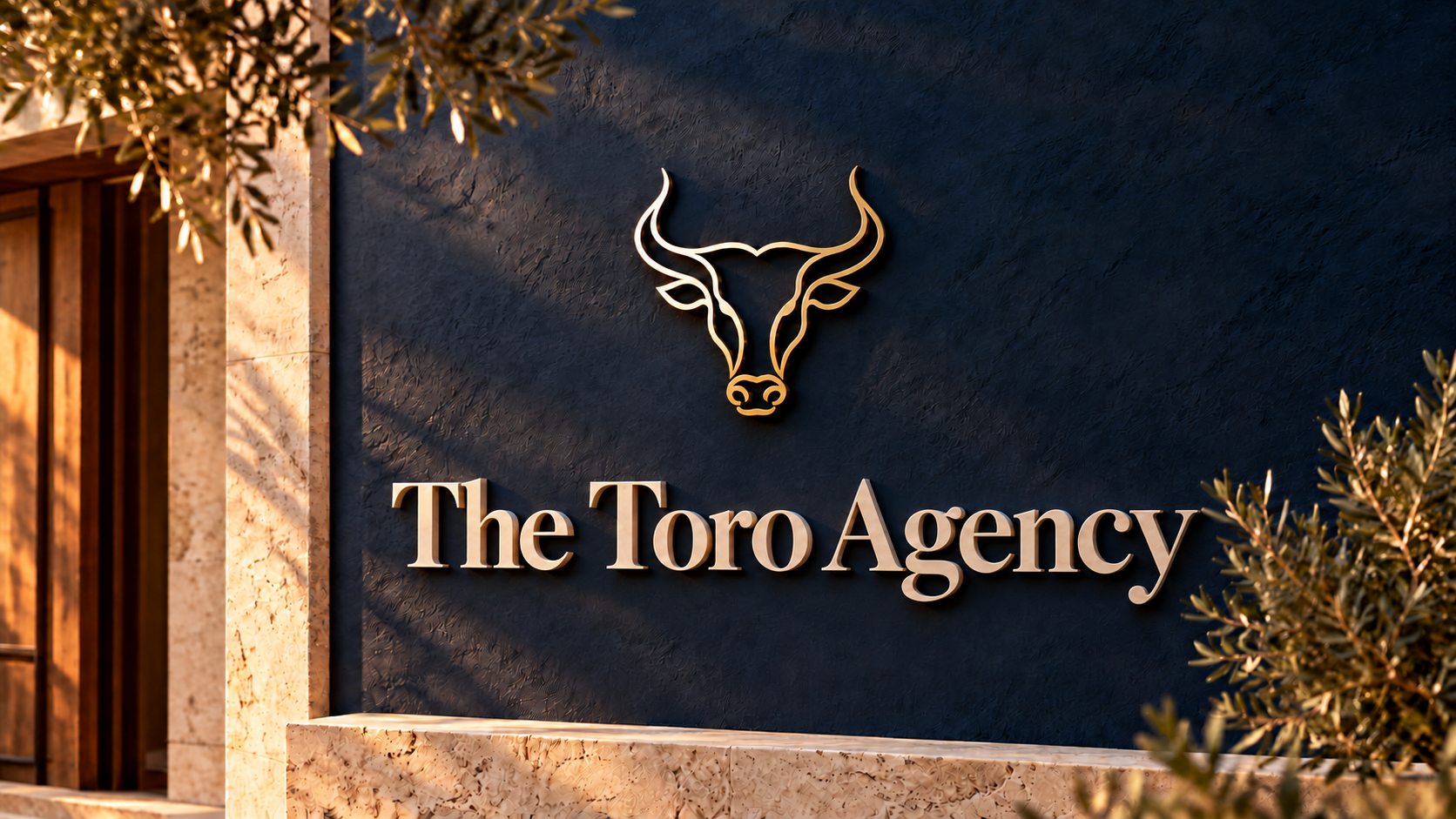
The Toro Agency
Creative portfolio case study. Signage, collateral, website visualizations and social campaigns are concepts; people and properties are illustrative.
Creative disciplines demonstrated by the supplied work.
- Brand Identity
- Digital Presentation
- Client Collateral
- Campaign Concepts
Insurance, refined.
The Toro Agency’s brand presentation brings a refined perspective to independent insurance. A distinctive bull emblem, editorial typography, and a midnight-navy palette connect the identity across digital experiences, client materials, and campaign concepts for Life, Health, and Property & Casualty.
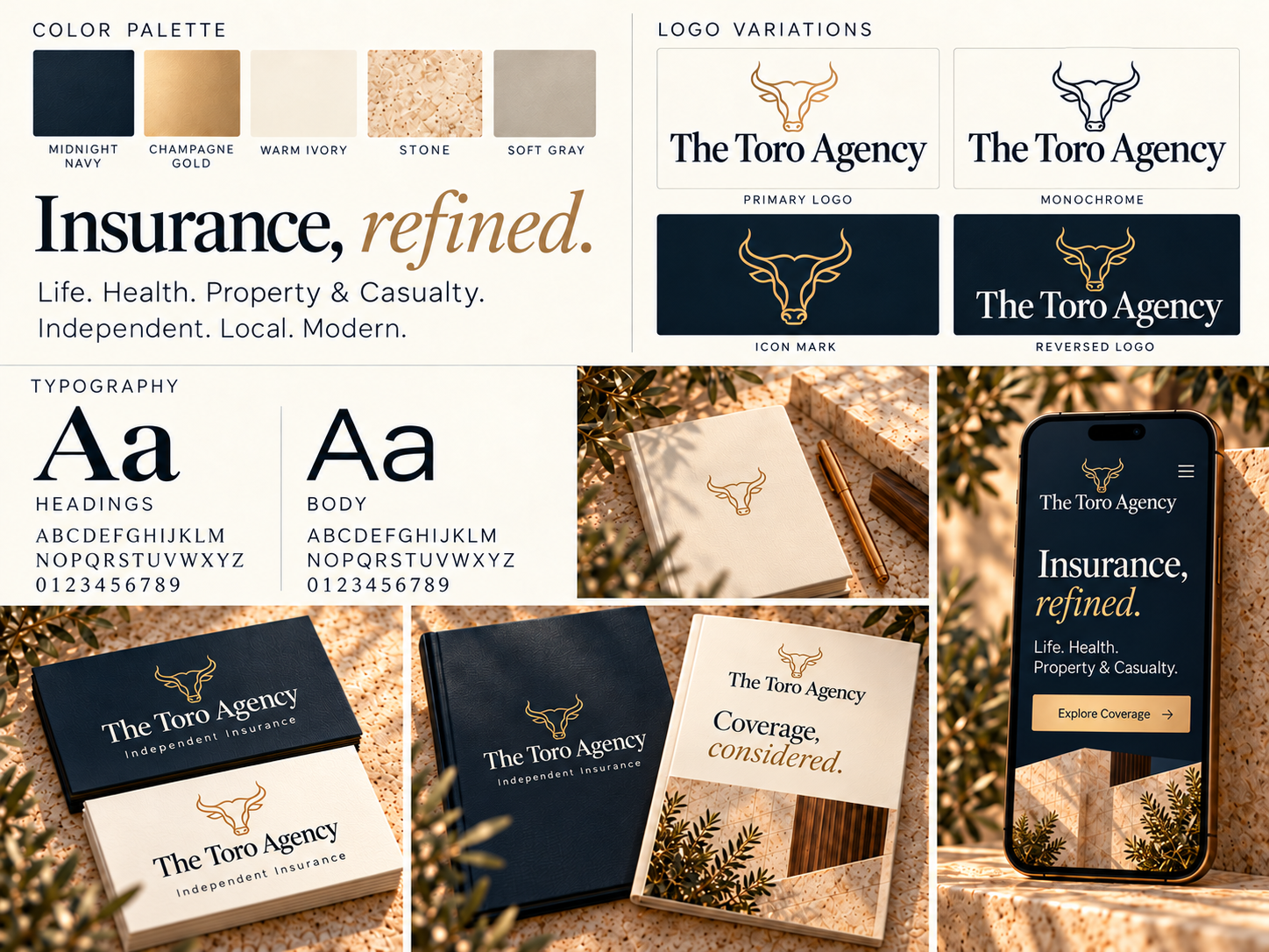
A confident mark. A considered presence.
A fine-line gold bull anchors the identity above an elegant serif wordmark. Midnight navy, champagne gold, and warm ivory establish a consistent visual language, balancing a strong emblem with restrained typography and generous space.
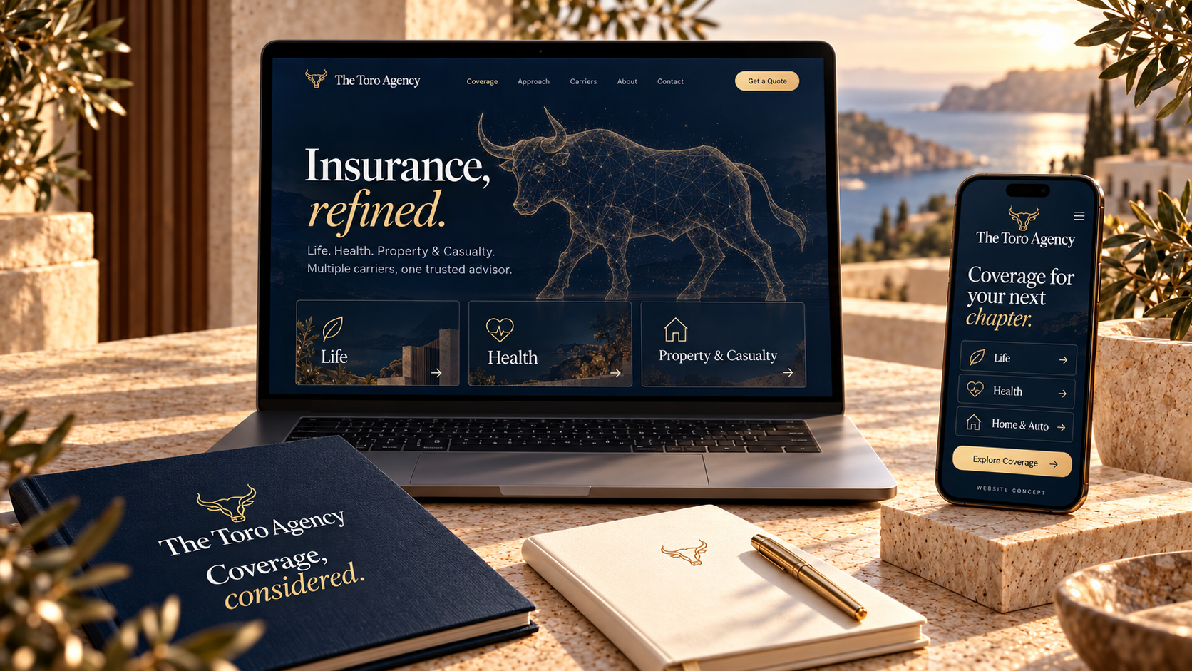
Clarity across every touchpoint.
Website visualizations and client-facing collateral carry the identity into practical applications. Clear coverage categories, focused messaging, and a consistent visual hierarchy connect the digital presentation with printed materials designed around the advisory conversation.
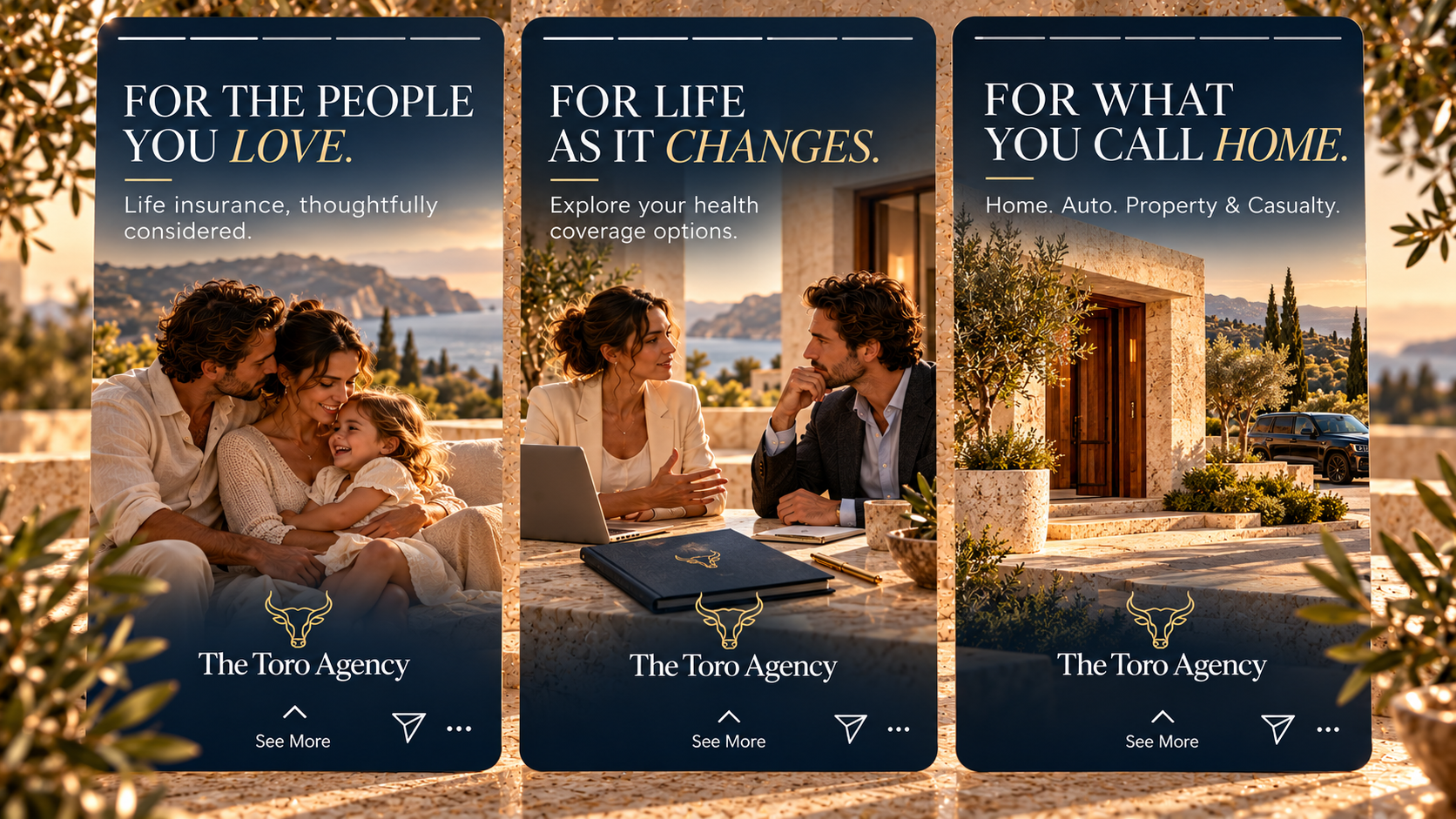
People. Life. Home.
Three coordinated social stories introduce Life, Health, and Property & Casualty through familiar moments and settings. Warm editorial imagery, concise headlines, and the navy-and-gold identity create a cohesive campaign expression.
A cohesive expression of independent insurance.
A connected brand presentation across identity, digital experiences, client materials, and campaign creative.